The Bevel in I
A Design Study/Creative Stabs in the Dark
Ah, the tiles-based UX journey embarked upon by Windows – a daring move that danced on the edge of innovation. With Windows 8's introduction of live tiles, Microsoft aimed to blend touch and desktop experiences seamlessly. These dynamic blocks showcased real-time information, offering a glimpse into users' digital lives at a glance. However, the departure from familiar icon grids proved challenging for some, and as Windows 10 emerged, the tile approach stepped aside for a more balanced design. The tiles-based UX remains a testament to the delicate equilibrium between pushing boundaries and respecting user expectations.
Microsoft's venture into tiles was a bold leap in UX with the introduction of live tiles in Windows 8. These dynamic blocks aimed to harmonize touch and desktop experiences, displaying real-time information for quick insights. Yet, the departure from conventional icon grids posed a learning curve for users. As Windows 10 dawned, a shift back to familiar design elements highlighted the challenge of innovating while keeping user comfort in mind. The tiles-based UX saga exemplifies the dynamic interplay between pushing design boundaries and meeting user expectations.

A UI made for Radio
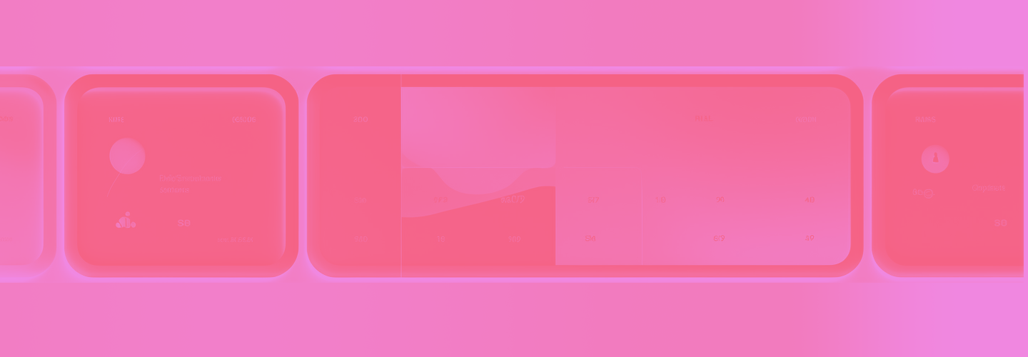
I aimed to begin with tiles that stood in stark contrast to the ones left behind by Microsoft. My goal was to steer clear of the usual by avoiding the reliance on Material's card design. In this pursuit, I focused on the aesthetics rather than content, striving to capture the essence purely through the look and feel.
Abstract appeared as the ideal path to break free from the constraints of the old tile design language. So, indeed, we're veering away from elements that resemble anything found in a UX for quite a while.


One particular aspect that has emerged as a glaring outlier is the presence of the massive gelatinous bevels. These once seemed like a fitting tribute to the tactile nature of candy and sweets, yet now they stand as the most conspicuous offender, overshadowing the essence of the design. The decision to cut through this excess and bid farewell to these bevels represents a pivotal step towards refining the design into a harmonious blend of visual fascination and functional coherence.


The Bevel in I
While the allure of aesthetics and visual charm cannot be underestimated, the path forward demands a measure of practicality that aligns with the intended purpose. Striking this balance between the delightful allure and real-world utility is paramount. It's a realization that beckons for the trimming of unnecessary excess, a shedding of what doesn't serve the ultimate objective.