
Cases of projects in crisis and
what it took to save them
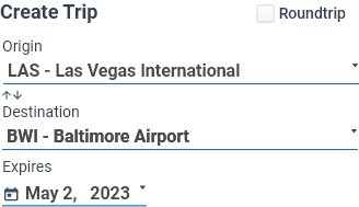
Scope Creep + No Versioning
The Problem
Navigation was confusing. User journeys were not established during the initial design phase, leading to scope creep and feature versioning oversights.
The Fix
To mitigate these issues, I isolated user paths and ultimate purpose. By dissecting processes into distinct and efficient flows, I managed to streamline the user journey and remove redundant and misplaced user interactions.
Simplify and Reduce
Redundant screens were reduced by refining navigation paths, eliminating unnecessary user inputs, and enhancing automation wherever possible.
Structured Release Strategy
Recognizing the significance of proper feature versioning, I introduced a structured release strategy. This facilitated clearer communication with users and stakeholders about the app's evolving capabilities and eliminating scope creep. By assigning version numbers and providing detailed release notes, I ensured that each update was transparent and well-understood, minimizing confusion and optimizing development efforts. This combined effort to simplify user flows and enhance feature management significantly improved the overall project's efficiency and user/stakeholder satisfaction.


This new flow was extracted from the mess above.

+ Benefits

“By essentially replicating the mobile experience as a side sheet within the desktop app, we not only streamlined the development process but also minimized staff training requirements.”
An additional advantage derived from proper user journey analysis was the discovery of a nearly identical flow shared by both the mobile and desktop versions. Leveraging this insight, the development team designed a unified flow for both app variants. By essentially replicating the mobile experience as a side sheet within the desktop app, we not only streamlined the development process but also minimized staff training requirements. This approach empowered the staff to offer more informed and effective assistance to customers, ultimately enhancing the overall customer experience.

Fixing Frustration with Automation
A single screen has the potential to create a maze of options for users, either becoming sources of exasperation or pathways of seamless navigation. In this app, initial testing found users becoming frustrated with adding information repeatedly.
Going back to the user paths, I was able to establish points of automation. If automation wasn’t possible, I was able to identify points in the journey where the information could be entered only once. From those points and on in the journey, the entries saved to the customers profile and automation could streamline any other possible choices.
Auto-populating choices aligned with their traveler details, like the count of travelers, pets, wheelchair accessibility, etc., we can significantly trim down app usage time. This means users can spend less time fumbling through the app and more time enjoying the offered accommodations.

During the initial testing phase, we uncovered scenarios where users might experience confusion due to sluggish network speeds, leading them to question whether the app was processing, downloading, or loading. In response, we strategically pinpointed stages in the user journey susceptible to performance challenges caused by slower networks. Subsequently, we implemented enhanced status messages and informative pop-ups, proactively addressing these potential concerns and ensuring a smoother and more informative user experience.


